And…Day number three for posting consecutively! Woohoo! The kids aren’t even back in school yet, but I’ve been so busy in Tim Holtz’ Creative Chemistry 103 that I can’t stop working in the craft room. Once again I’m sharing distress crayons with texture paste and stencils.
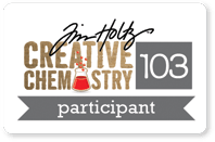
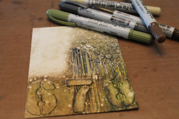
I began this card by applying two individual layers of opaque matte texture paste over three different stencils. First I used bubbles(?) with stripes, and allowed this to dry. Then I layered the numbers stencil over the dried stripes, and waited for this to dry as well. The next step was to paint the entire panel in a thin coat of collage medium, and waited for this to dry. Next I worked in small areas coloring with the crayons and blending with the crayons for a grungy effect. I kept working more crayon into all of the nooks and grooves of the texture paste, and lightly added color to the white left side. Finally I wiped the excess away with a dry paper towel, then sprinkled water, and dabbed away the excess. Seriously grungy on this one; I think I channeled Tim for this!
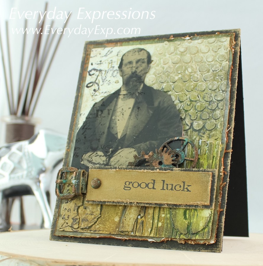
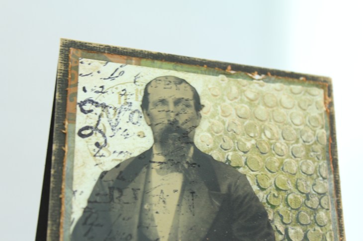
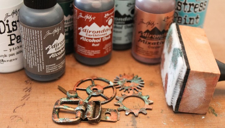
What do you think about the layers of texture paste? Worth the drying time wait. I like this one.I sanded Tim’s nostalgic kraft-core cardstock in black, and distressed a paper panel from crowded attic for the layered background. I decided I need lots more of this black cardstock. I am in love with this sanded look. The gentleman is a found relatives card that I fussy cut. Before adding him, I used a second generation stamp of the clock in coffee archival ink. Then I glued the picture, and used the Stamper’s Anonymous Papillion text stamp in black archival ink over everything. (I didn’t want to stamp his face originally, but I think I’m okay with the way it turned out.)My new favorite card trick: Dab distress paint onto idea-ology metal elements, and then add alcohol ink for a vintage copper look.After painting and adding alcohol inks, lightly dab the elements in VersaMark and sprinkle with distress vintage photo embossing powder. After heating (and allowing it to cool), rub the excess powder off with your fingers. Seriously! This aged copper look is my new go-to look for distress!The sentiment is from SA saying stuff set, and I stamped it in archival ink onto sanded and distressed Kraft-core.Finally, everything is attached to a black Simon Says Stamp cardstock base.
There it is. My third card with distress crayons and texture paste. Do you like this one? I will be playing with alcohol inks for a few days, and then will be back with that homework to share.
I'm a wife, mom, and former teacher. I decided to create a blog and share some of the ways I express myself everyday. You'll usually find my latest card creations, but I plan to throw in some projects from around the house as well. Maybe I'll even post a recipe once in a while. You never know what you're going to get!
View all posts by erint2015
5 thoughts on “Vintage Good Luck Card”
Thank you for sharing the process you used to create this card. His face being stamped is perfect.
I tried to add more pictures and explain things in the caption verses longer written paragraphs. Blah, blah, blah…I thought. What do you think? Is this format more interesting?


Thank you for sharing the process you used to create this card. His face being stamped is perfect.
LikeLike
I tried to add more pictures and explain things in the caption verses longer written paragraphs. Blah, blah, blah…I thought. What do you think? Is this format more interesting?
LikeLike