Hi Everyone, and thanks for joining me again! I have been so inspired lately by all of the cards created by the amazing Altenew design team, Jennifer McGuire, and many others using Altenew’s bold alphabet dies. I finally broke down and ordered my own set last week, and I am so excited! Today I’m sharing my challenge submission for level 1 in the Altenew Educator Certification Program. Eeek! Wish me luck!!
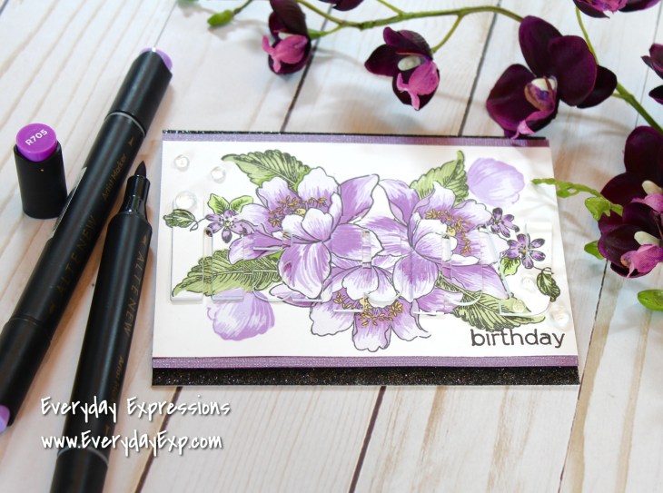
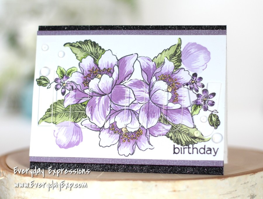
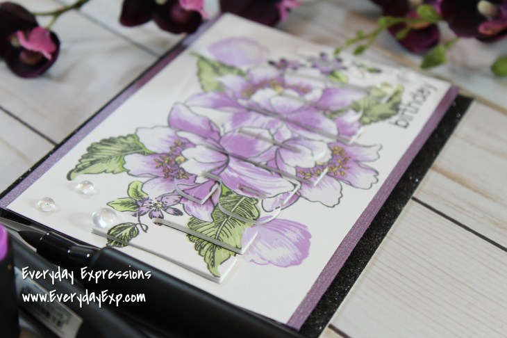
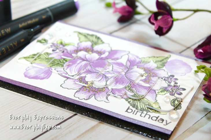
After completing all 10 of the Altenew Academy classes in level 1, my final project assignment was to create a card using at least three different class techniques. This eclipse card includes stamp layering with the Garden Treasure stamp set, inlaid and dimensional die cutting with bold alphabet dies, and self-made glitter paper for sparkly trim. Your eyes play tricks on you when you look at it. At first, you only see the stamped flowers…but there’s something going on…what is it? Oh! It says ‘happy’ in the flowers! Turn the card a little and your eyes finally figure it out. Raised letters! (Originally I called this an ‘optical illusion’. I had never heard the term ‘eclipse’ card. Thanks to my sister, she finally told me the correct term! LOL!)
Techniques

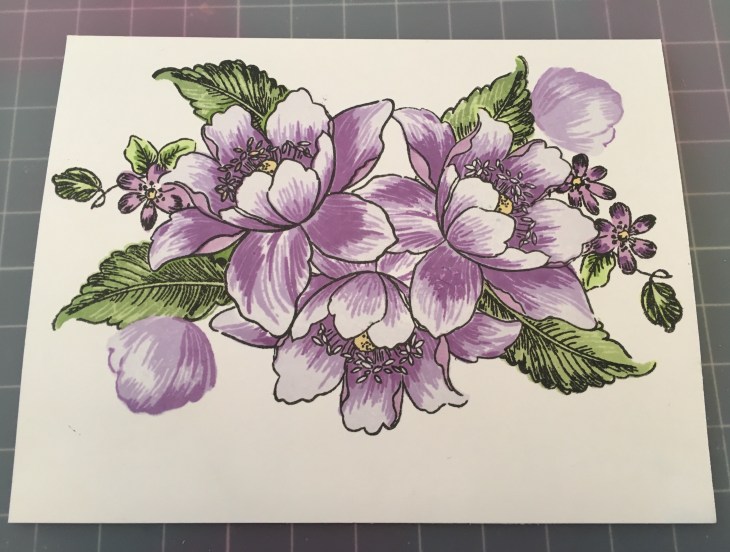
Layered stamps and masking: This is a new layered stamp set that I’ve been eyeing for a while, and I am so glad I ordered it along with the alphabet dies. All of the stamped layers give it a beautiful artistic look. I took much care and time to create masks and layered the flowers and leaves to help create an interesting arrangement. I used Inkadinkado masking paper, and fussy cut two big flowers with one smaller bud. The MISTI helped align each stamp layer, and in making multiple cards (in case I messed one up – and I did!)

Stacking die cuts for dimension and in-laid die cutting: I die cut five sets of the word happy from white card stock, and glued them together to build height on the card. The scariest moment is when you tape the letters down over that gorgeously stamped picture, say a prayer, and hold your breath while running the whole thing through the die cutting machine! Thank goodness I didn’t mess it up! And it’s mostly straight!!! I glued the dimensional letters into place over a Simon Says Stamp glimmering purple cardstock base, and added the stamped, die cut letters on top.
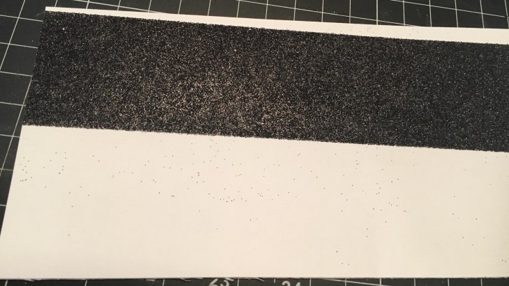
Glitter paper: I created black glitter cardstock for this project. I have a full tutorial on this technique HERE.
Tips:
Have patience! This was not a quick and easy card to create. I even stepped away half-way through the stamp layering and masking. After I forgot to move a flower mask and ruined one card, I knew it was time to take a break.

Use a T-ruler to square up your die letters as precisely as possible. Then use low-tack tape to hold everything in place for die cutting. My tape was too sticky and tore some practice runs in the empty ‘p’ spot, so I learned to add a piece of post-it note there. Does this make sense?
Burnish the glitter over the tape with both a bone folder and then your finger. This greatly reduces extra flaky mess. Don’t forget to wipe up the mess with a Swiffer sheet.


Use a black alcohol marker to cover the white cut edges of the glitter strip. Always edge or outline cut pieces with a matching or black alcohol marker. This creates a polished and finished look! Try it! You’ll see what I mean.
Trick: Altenew Artist Markers and an optical illusion
If you use Altenew Crisp Dye Inks often (like I do), you need the Artist Markers too! My sister and I debated this topic just the other day. She didn’t understand why I bought the Altenew markers when I already own Copic markers (and coloring is not my favorite crafty pastime.) My immediate response was that they match my dye inks, but honestly I still didn’t know if I would really use them that much. (I just didn’t share that concern with her.)
Well today I proved my point! When masking, sometimes the stamped layers don’t always match up, and there is often a white area that’s not inked. So what did I do? You got it! I grabbed the coordinating marker color, and used the fine point to color in those areas. Ta-dah! Perfect solution.
Also, many layered stamp sets have several extra pieces that don’t have matching layers – it’s just an outline. Yes, I like these as just an accent stamped in black or neutral colors, but sometimes you want them to match. So today I snatched the markers and colored the little flowers in to match everything else. Yay! And then I called my sister to tell her that my investment already paid off! ;)-
Now if you don’t own the matching markers or use a different ink line: Try using paper blending stumps (artists call these tortillions LOL). Place the nib on the ink pad to color, wipe excess on scrap paper to get the perfect shade, and carefully color in the uninked areas. You can find this tool on Amazon HERE.
Use die cuts within stamped images to create interest and create optical illusions!

So, what do you think? Is it worth the extra time and effort? Are you as obsessed with these new bold alphabet dies as I am? I can’t wait to see what you share! Love and artsy hugs!
Erin

Wow, Erin!! You aced the challenge! This is one very gorgeous card! Love your execution and design! The layering is FAB!! I love the use of bold die cut! AWESOME job!
LikeLike
Thank you so much, Virginia! I had fun creating this one, and I adore the stamps and dies I used. So glad I ordered them! Thanks again for all of your support! I am thrilled!
LikeLike
Oh Erin, this card is so beautiful and perfect for the challenge. The use of the letters and stamping them is amazing. This card is perfect in every way.
LikeLike
Oh, thank you so much!! I do really like the way this turned out.
LikeLike
Beautiful card and thanks for all the great tips as well!
LikeLike
Thank you so much for stopping by and leaving a kind comment! Hope to see you again!
LikeLike